by Rosie Gaynor
If your text is long—and if you want it to be read—then chances are it’s going to need some typesetting.
How much?
An easy way to decide how much time and money to devote to typesetting is to consider your choice of printing house and paper stock. For text that is meant to be read, I’d recommend that…
- The typesetting be as good as or slightly worse than your printer. A bad print job is going degrade your type, so it’s worth paying for good printing.
- The typesetting be as good as or slightly better than the stock. Good stock cannot cover up bad typesetting. Good typesetting, on the other hand, can help the reader forget a lesser stock. (Bad stock can degrade the type, though, so go for stock that is at least good enough.)
It feels so heartless to do this kind of triage, to engage in lowly budget-based bargaining when books are involved. But our goal is to get the book out the door and into people’s hands without losing our shirts (or hair), so we do the very, very best we can with the resources we have at the moment.
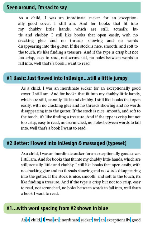
The illustration below shows the difference typesetting can make. (To really see the difference, download the PDF and print it on a good printer.)
Book designs differ, but usually a good typesetter’s goals look something like this:
- Word spacing, letter spacing, and line length work together to create lines that read evenly and easily. (It is important to see a print-out of this. An onscreen PDF is not going to show you what you need to see here. Print out the PDF of the sample above and you’ll see for yourself how big a difference it makes to view type printed on paper.)
- Hallmarks of good typography have been considered, such as curly quotes, hanging quotes, curly apostrophes instead of prime symbols, proper use of hyphens, en-dashes, em-dashes, and real small caps (instead of InDesign’s approximated small caps). Old-style numerals, lining numerals, proportional numerals, and tabular numerals have been used purposefully.
DIY? Maybe.
If you are used to looking carefully at type (say, maybe, you’re an editor?) and if you’re comfortable on the computer, you could probably pull off something like Example #1 above on your own. I did, years ago, before I took design classes.
You’ll need to know the basics of InDesign and you’ll need to have a good feeling for what typeface and type size fits your text block well. If you go this route, I’d highly recommend you take a short class in InDesign (at, say, my favorite: School of Visual Concepts in Seattle) and that you find a copy of Mitchell & Wightman’s Book Typography: A Designer’s Manual. (It’s a gem of a book, content-wise and beauty-wise. Just turning the pages—a Precision fine 130 gsm stock—is an experience!)
Example #2 above? That kind of work takes some training and a really good eye. And it takes time. And dogged patience. Generally speaking, it takes a pro.
If you do hire a typesetter, ask to see a hard copy of a book that s/he has typeset. One page is not enough, as you’ll want to see how s/he managed the awkward paragraphs. (There are always paragraphs that refuse to cooperate.) With that book in hand, you’ll also be able to tell whether s/he had the stamina to make the type look even throughout the entire piece. If you go with a printing company’s in-house typesetter, ask to see a sample book done by the person who will be working on your book. They might fuss a bit, but I’d ask anyway.
How Much Do Typesetters Charge?
Typesetting fees are all over the place. But, like olive oil, cheese, chocolate, and shoes, the cheapest ones are generally not the best. The 2013 Graphic Artists Guild Handbook of Pricing and Ethical Guidelines suggests $6–$12 per page for a simply formatted book, like a novel. Figure $900–$1,800 for a 150-page novel.
It’s daunting. I think it helps to consider the printing–stock–typesetting balance. And to go back to the very basics: What makes the most sense for your goals, for your budget, for your preferences, and for your timeline? What’s your gut telling you?
Why bother? Because good typography will set you apart.
Scribes of old knew: Well-drawn pages paid respect to the words and to the author. Eventually, we figured out that well-set pages allowed for easier reading, greater comprehension, and better sales. And we book lovers today still know: When we hold a well-set book in our hands, we are holding a treasure.
We live in a world of typographical atrocities. Alas. But it’s also true that we live in a world of near-perfect typographic masterpieces. Your book will be somewhere on that typographical spectrum. The nice thing is that you get to choose where.
—
Rosie Gaynor owns Seattle Scriptorium—the business of beautiful communication. She has worked in the design departments at Tiger Oak Media, Puget Sound Business Journal, and TCS World Travel. She has typeset three books and would love to work with you on yours. She can be reached at rosie[at]seattlescriptorium.com.
Are you a publishing professional or a service for publishers? Would you like to submit an article to Book Publishers Northwest? Email bpnwnews[at]aol.com.

Excellent article. I am also a book designer, and studied typography as part of my course work at Rochester Institute of Technology back in the Stone Age (pre desktop publishing). Consequently, I too spend time on the nuances of fine typography with every publication I produce. It may not seem necessary to some, but in the end, a well typeset book will be easier to read as well as a thing of beauty. I’ll be giving a talk on understanding typography for the project manager and/or proofreader at the Northwest Independent Editors Guild conference on Oct. 10 in Seattle. For more information, visit http://www.edsguild.org.